One music theory professor I had argued that great composers (the examples were Schubert and Mozart) sometimes arrived at specific compositions through having taste, rather than through an application of rules. In other words, they re-invented the rules, through their own genius. He cited examples as evidence in which the form almost matched textbook forms–but not quite. The argument being that if the form governed the composition, and that if working within the form was a metric of success, then the composer would have exactly produced the structure. Well . . . possibly, possibly not. Methods and motives of persons who worked centuries ago are, of course, a bit speculative, but perhaps these composers simply reinterpreted the the rules or decided to slightly violate the rules in order to provide entertainment to their more sophisticated listeners. Indeed, rather than arriving at rules through taste, I tend to think of a departure from the rules as a matter of taste or style.
In any case, artists of all sorts have contemplated the rules of composition over the millennia. It’s interesting to read photography blogs (including diatribes) that touch on composition: opinions range from a strict embrace of classical compositional principles to a complete rejection of all rules that would presume to govern photography. Right in the middle of this continuum (where I fall) is the notion that rules of composition exist to prevent the most egregious form of photographic error: the production of the classic “tourista” shot with ma and pa, too far away, exactly in the center of the image (being slightly out of focus and over-exposed rams home the effect). The most extreme position, a total rejection of rules, is no doubt, a gift of the 20th Century, a century that embraced Marcel Duchamp’s Fountain as one of the most influential of all works of art.
Sadly, photo blogs are filled with angry, bitter complaints from people who have had their work rejected by editors for technical or compositional transgressions. One complaint I have read is that first a submitted image is rejected because of a particular compositional “flaw.” Then, the victim notices the publication of an image with the exact same “flaw” in the following issue! What’s a shooter to think? Are images selected by whim? Would it help to be the editor’s brother-in-law? Although the answers are probably yes and yes (most of the time), I have decided that by adopting a few generally accepted compositional rules, I can expect my images to be better received than if I were to go Dada. Luckily as an amateur (with a WordPress account!) still on a rather steep learning curve, one who is simply doing this for fun and personal growth, I can afford to be free and not worry about what a photography editor thinks of my work.

For those of us who are not operating at the level of Schubert or Mozart, a few simple rules to apply are:
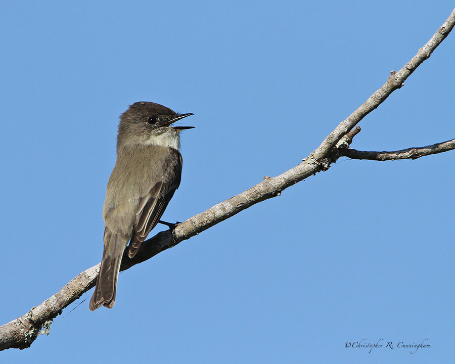
1) Avoid placing the subject in the center of the frame. This simple concept is stated in more detail as the rule of thirds and the golden ratio. Many, many articles on these concepts already exist on the web (among other places), and I’m not going to rehash these ideas here.
2) Avoid clutter as much as possible. I call uncluttered images “strong images.” These shots look good at any scale, even as a thumbnail.
3) Leave accommodation space for action, generally ahead of the bird . . . unless you’re trying to make a point about where the animal has been.
4) Look for strong linear or areal elements that organize space or direct attention.
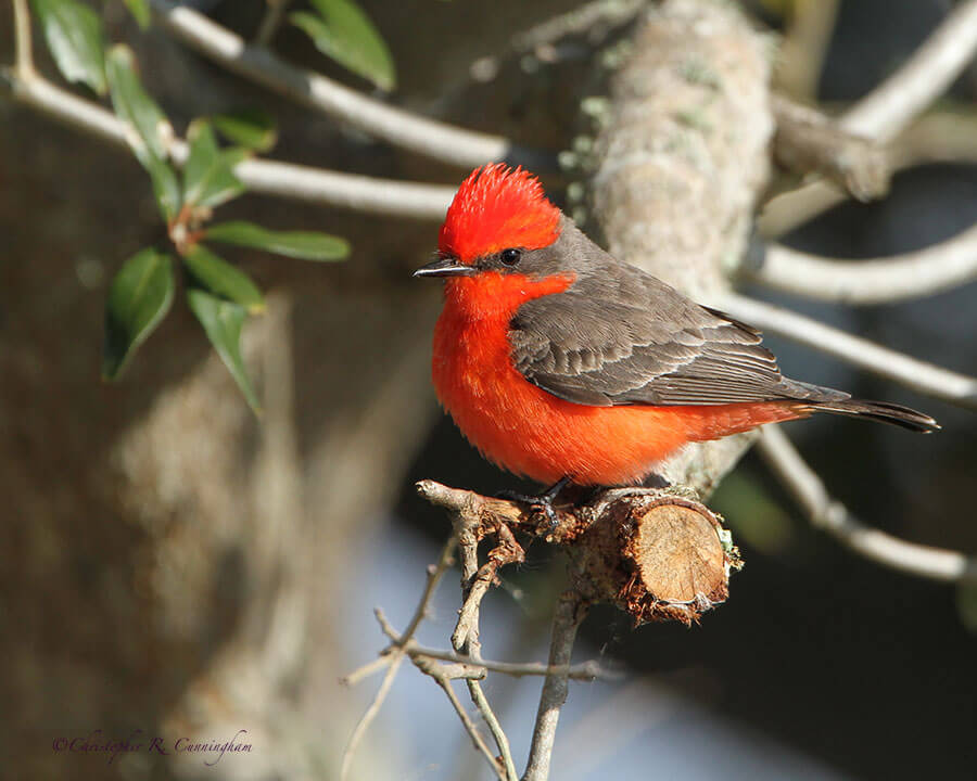
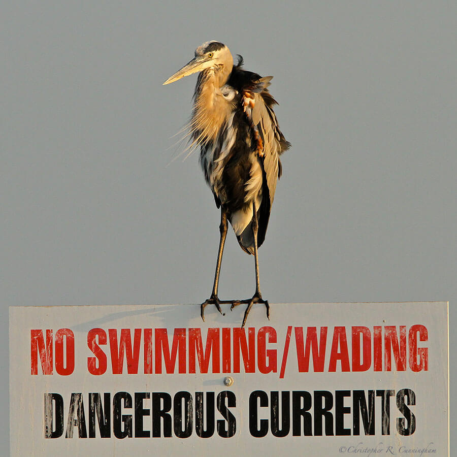
5) Leave out man-made objects. I consider inclusion of man-made structures in nature photos to be a flaw. I abhor “feeder shots.” Images of birds on fences, signs, posts, lawns, and on branches with cut ends and so on, are in my book, flawed. Humans have insinuated themselves into nearly every nook and cranny of this planet, and their grubby fingerprints are recognizable in many photos–and I work hard to eliminate them. I recognize that I am fairly eccentric in this regard, as many publications routinely include man-made structures in “nature photos,” and I know of photo contests that include “feeder shots” as a category.
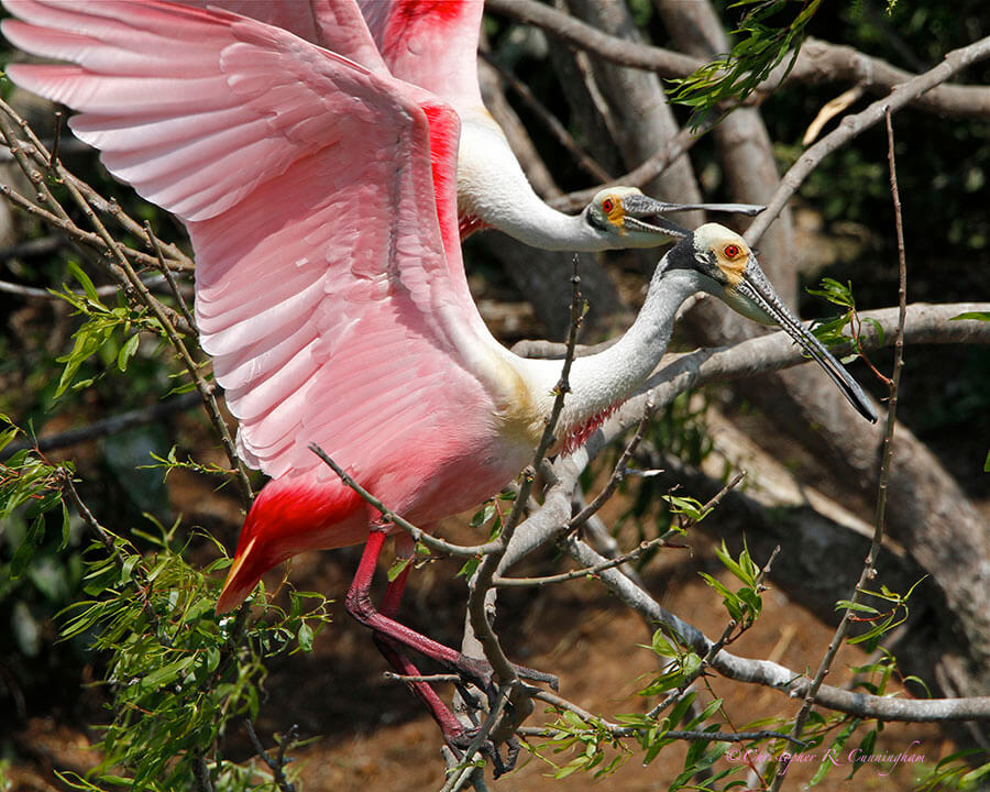
6) Try and capture birds and other wildlife doing something. Bird photography is hard enough that I am often thrilled just to capture a sharp, properly exposed image of a bird sitting on a branch. I do, however, work hard to capture animals actively eating, fighting, singing, and so on.

Finally, a question has emerged in my mind about the rules of composition while writing this page: are there any special considerations when working on the web? In other words, when working with medium resolution jpegs of a small size, are deviations from the rules called for? It seems that the web has a few special challenges of its own, and I am continuing to work my way through them. I recently heard from a professional wildlife photographer at a Houston Audubon Society (HANPA) meeting about the bias against cropping in the professional editorial community. He also stated that there was no taboo against cropping on websites–and I feel completely free to crop as I like, particularly because this website is adaptive (it restructures to fit any size device). Because someone could be looking at my images on an iPhone, I want my images to fill a big chunk of the frame, perhaps not as large a part as would be required in a gallery print. Further, some attributes of web images have a great deal to do with security (and speed of download), and not composition or artistry. Although no amount of security can keep a thief from stealing your images, you can make yourself a harder target than the next guy. But only posting signed (in the file and on the image), medium-resolution images for security purposes leads to a decrease in quality. As far as signatures are concerned, I have taken the advice of W. Majoros in his exceptional Secrets of Digital Bird Photography in signing images in the style of the old masters (of painting)–visible, but rather inconspicuous, and often blending in places.
My final point is that, for me, the rules of composition exist primarily to show off the bird to the fullest extent possible. Any approach that does that is fair game, and I am excited to press on ahead and continue to explore the intersection of nature and the rules of composition.

© 2013 Christopher R. Cunningham. All rights reserved. No text or images may be duplicated or distributed without permission.